Logo, grafisk design, webdesign, webutvikling, tekst | Canva, WordPress | 2024-2025
Trondheim
Green Fest
Møt Trondheim Green Fest – en grønn mat- og kulturfestival i Trøndelag
Festivalen hadde hatt en pause siden den sist fant sted i 2022, og det nye styret ønsket i 2025 et stort comeback i anledning 10-årsjubileet for den aller første festivalen.
Organisasjonens mål er å øke forståelsen for hva veganisme er, og fremme veganisme på en positiv, objektiv og faktabasert måte. Den fremhever hvordan et vegansk kosthold og en vegansk livsstil kan være positivt for dyrevelferd, klima, miljø, bærekraft og helse.
For festivalens comeback i 2025 ba styret om en ny visuell identitet og nettside for å utvide rekkevidden, og Studio Nordique var strålende fornøyd over å kunne bidra til en så god sak!
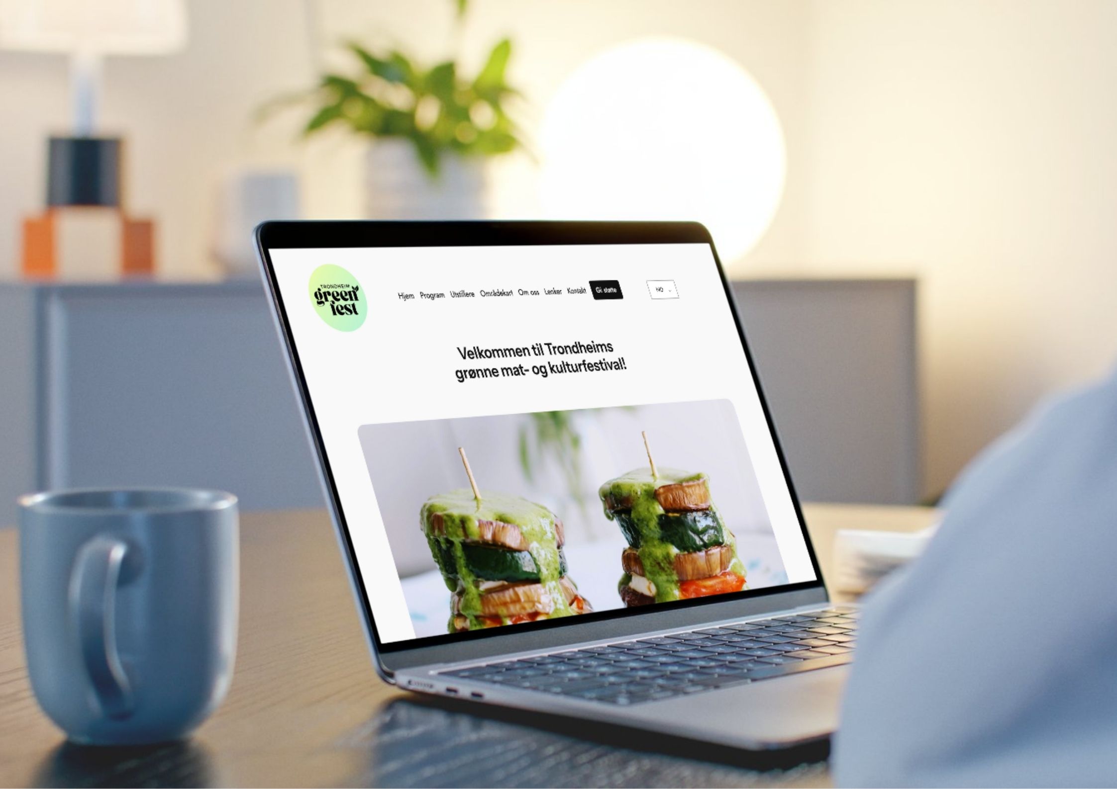
Visuell identitet
Logoen har fått en fullstendig makeover, med en frisk bakgrunn i lysegrønne fargetoner med et gult skjær. Vektleggingen er lagt på teksten «Green Fest». Skrifttypen TAN Ashford er en fet serif med høy kontrast, noe som gjør den til en allsidig og elegant skrifttype. Med et snev av vintage-vibber gir den et elegant og dristig utseende. Den passer godt sammen med teksten «Trondheim» i skrifttypen Instrument Sans for et balansert uttrykk. For de som er innviet, markerer de to bladene festivalen som vegansk.
Webdesign
Nettstedet er bygget med WordPress. Den er minimalistisk og konsis. For å gjøre den tilgjengelig for alle som ikke snakker norsk, har vi lagt til en engelsk oversettelse for hele siden. Før, under og etter festivalen oppdaterte vi navigasjonen og innholdet for å best mulig tilpasse interessen til de besøkende i hver av periodene.
Plakatdesign
Festivalplakaten har et svarttonet bakgrunnsbilde av en vegansk rett. Den kontrasterende hvite teksten annonserer dato og sted for festivalen, samt hvilke aktiviteter som kan forventes. QR-koden leder direkte til nettsiden. Sponsorer er oppført med en vertikal tekst som rammer inn venstre marg.
Programmet
Under festivalen var det varierte konserter, informative foredrag og vakre forestillinger. Programmet gjenbrukte plakatbakgrunnen og layouten for å vise tidspunktet for hver av arrangementene.
T-skjortene
Årets festival ble gjennomført i samarbeid med den lokale organisasjonen Lamo Marked. For frivilliggjengen designet vi en t-skjorte som kombinerte festivalens og markedets logo. T-skjortene ble bestilt fra et lokalt trykkeri, og er både økologiske og fair-trade.
SoMe-ansvar
I forkant av arrangementet publiserte vi jevnlig på sosiale medier om utstillere, foredragsholdere og programmet. Vi publiserte og delte historier om bodene, de besøkende, forestillingene, konsertene og gleden. Dette har vært en av de hyggeligste oppdrag som SoMe-ansvarlig vi har hatt!
Festivalens områdekart
Med mange deltakere, stands og aktiviteter var det avgjørende å ha et tydelig kart over festivalområdet. Festivalpublikummet kunne navigere blant utstillerne – både kommersielle og ideelle – ved hjelp av det praktiske kartet som inkluderer både tall og fargekoder.
Flaggene
For å markere inngangene til festivalen ble vi spurt om å desigen et dråpeflagg og et strandflagg, det første med kun festivallogoen, det andre også med Lamo Marked sin logo.